MAKING A COHESIVE ALBUM THAT FLOWS
- Jan 5, 2022
- 5 min read
Sharing a walkthrough of my December Daily 2021 Album

There are so many options out there when it comes to all the designs, products and fun stuff you can use in scrapbooking. If you're anything like me, you'll love it all and be tempted to buy everything!! But let's be honest...can you (will you) actually use all of it? Probably not. I put together this post to share how I used a few repeating products + page designs to create a cohesive look to my 2021 December Daily album.
SO MANY IDEAS
As a guest instructor, was fortunate enough to have the products in the main kit this year, as well as the entire release digitally as these were featured as part of the Create with Canva class I taught at Ali Edwards Design Inc. This years release (2021) was jam packed with products and the ideas from the Prep Day & Product Play classes were fabulous! Honestly, I was a bit overwhelmed with the all the awesome page ideas from the talented designers. Since I got to play with so many of the designs teaching the foundations of Canva using the digitals, I knew I could recreate the pages easily. But for my own album I wasn't sure I wanted each page to have it's own look. I was learning towards creating pages that flowed together.
FOUNDATION PAGES
Traditionally I don't do foundation pages. If you're new to December Daily, the "foundation page" concept are pages that you create for your album in advance of December. Then during December, you only need to print your photos & add some journaling. For me, I most often use the photos I take as a jumping off point for my pages, so having a lot of pages prepped in advance, that I may (or most likely may not) use isn't something that fits the way I scrapbook. But I did really love this one by @freklepickle that plays with weaving ribbon and just had to give it a try. Totally took me back to paper weaving in grade school.


I knew that I could easily add a photo or even pattern paper to the back of the tag. When working on my album during December I ended up backing the woven ribbon tag with a photo of ornaments that I love to put on our tree. I added the curved arrows + journaling in Canva before printing out the photo. It worked out perfectly and is absolutely one of my favorite pages ever!!
MAKING IT FLOW
As I was putting my pages together I noticed that I kept reaching for, or gravitating to, a few specific items. Plastic Hearts + Canvas Word Strips + smaller embellishments like felt & glitter stars were really easy to work with. Also I love to use journal cards that have repeated titles or a constant feel & font to them. Using them throughout the album creates cohesiveness right off the bat. I also noticed I preferred using a smaller prints or pattern paper, picking ones that didn't have a lot of colors going on. I've grouped the photos below as examples of how these repeated elements helped create cohesion in my album.
1. Big Photos + Sentiments

Big photos that fill the page really make a statement. Adding word art to the photo makes the page fun! I finished these pages off by adding a transparent heart to make your eye travel the whole page. Black & white photos are always an option when the colors in the photo are challenging to work with or the lighting is just off. In the zoom photo the room lighting made the photo really yellow, by making it black & white you can't tell, and the colored hearts just pop on these pages.

Here's a couple more full page photos with just the hearts added which creates a clean & simple look with the full page photos.

2. Journaling Templates
I really liked a journal card in the In A Creative Bubble digital kit, so I set it up as a template to use as a place to hold longer stories. I thought of this as a place to check- in over the month and share an overview of what was going on. I ended up journaling three times, once at the beginning, once in the middle and again on Christmas Day. Since each card was created digitally it was so easy to change the color of the word art to blend with the photos on those pages. I added a simple sentiment on a canvas word strip at the bottom of each card.

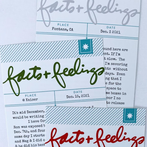


Here's how these 4x8 templates look set up in Canva. I made a couple of modifications to the digital image; I covered the original title on the card with a rectangle, then recolored it white to match the base color of the card. Then I added with a handwritten title that represented the "facts & feelings" of what I was wanting to say. I recolored the title using the duo-tone feature in Canva. (select both color swatches to be the same color to get the solid color change)


3. Group Small Embellishments
I repeated the same page design using pattern paper & wooden house embellishments paired with a canvas word strip throughout the album. I think it creates a familiar place for you eye to stop and rest as you browse through the pages.

Even when the stories had nothing in common, by using the red felt stars with a glitter star brad in the center created a repeated element that tied my photos together.

4. No Photo Pages
When you're short on photos, but you want your pages to flow, I like to use an embellishment with a journal card or pattern paper that ties in the colors of the corresponding page. I tend to like the look of the smaller prints as they seem to provide a sense of calmness and again a place to rest.

5. Beginning & Ending
I began my album with a journal card I enlarged to 6x8 and added silver glitter stars for some sparkle. I didn't plan this initially, but when I realized my album would now be ending on New Years Eve, I again reached for the glitter stars. Laying them added some extra dimension and I really like how these pages act like bookends in my album.

I hope that I have inspired you with some ideas of how you can create a cohesive flow in your own albums. You can follow me on Instagram to see more pages in my 2021 December Daily album. Or here to see my gallery of albums.
Got an album tip of your own? I invite you to share it in the comments.


https://soicau247.com/ bữa lướt thấy mọi người nói nên mình ghé thử cho biết, kiểu xem giao diện có dễ nhìn không thôi. Vào trang cái là thấy họ chia nội dung thành từng mảng rõ ràng, nên không cần đọc kỹ vẫn biết chỗ nào là kết quả, chỗ nào là phần soi cầu/dự đoán. Mình thích nhất là mấy bảng lô tô đầu/đuôi, trình bày theo cột gọn gàng nên nhìn một phát là hiểu, không bị loạn chữ. Với lại tiêu đề theo ngày tháng để khá nổi, nên lúc mình bấm vào “Xổ số Miền Bắc ngày 03/06/2026” thấy nó hiện bảng đầu/đuôi lô tô ngay, nhìn khá đã mắt.
DH88 mình mới lướt thử vì thấy bạn bè nhắc hoài, kiểu tò mò xem trang trông ra sao thôi chứ không có thời gian ngồi nghiên cứu kỹ. Vào cái là thấy giao diện khá sáng sủa, chữ dễ nhìn, kéo xuống không bị rối mắt vì họ chia nội dung thành từng khối rõ ràng. Mình có đọc lướt phần giới thiệu thấy họ để thông tin giấy phép PAGCOR với chứng chỉ GEOTRUST ngay trong bài, ít nhất là nhìn cũng đỡ cảm giác mập mờ. Mấy mục trên menu đặt gọn, bấm qua lại cũng nhanh, không bị giật lag gì. Nói chung chỉ xem sơ sơ mà vẫn nắm được ý chính nhờ tiêu đề…
tỷ lệ kèo dạo này thấy ai cũng nhắc nên mình ghé thử đọc cho biết, kiểu tò mò thôi chứ không định đào sâu. Vào bài là họ giải thích khá rõ tỷ lệ kèo là con số thể hiện khả năng xảy ra của một tình huống trong trận, đọc lướt vẫn nắm được ý chính. Mình thích kiểu viết không làm màu, câu chữ vừa đủ, không nhồi nhét quá nhiều thuật ngữ nên đỡ bị ngợp. Kéo xuống thấy các đoạn được tách gọn, nhìn thoáng mắt, không phải căng não dò từng dòng. Mấy tiêu đề như “kèo bóng đá là gì” đặt theo từng khối nên mình liếc cái là biết đang ở phần…
keonhacai55 bữa mình thấy mọi người nhắc nên ghé thử cho biết, chủ yếu xem giao diện chứ không ngồi đọc hết nội dung. Vào trang cái là thấy họ trình bày kiểu gọn gàng, chia thành từng khối bài nên lướt xuống khá mượt, không bị rối mắt. Mình để ý bài Napoli vs Torino (01h45 ngày 28 04) được đặt nổi bật, tiêu đề to với vài dòng mô tả ngắn nên nhìn phát hiểu đại khái luôn. Mấy phần “soi kèo” với “nhận định” tách riêng nên tìm đúng thứ mình cần cũng nhanh, khỏi phải kéo qua kéo lại. Nói chung cảm giác dùng như kiểu quen tay sẵn, vì các heading trận đấu được đóng…
https://fly88.poker/ dạo này mình thấy nhiều người nhắc nên tiện tay vào nghía thử cho biết. Mình chỉ lướt nhanh thôi chứ không ngồi đọc kỹ, mà cảm giác đầu tiên là trang làm khá “gọn mắt”, chia khối rõ nên kéo xuống không bị ngợp. Mấy phần hỏi đáp nhìn kiểu tách ý theo từng câu hỏi, đọc lướt là bắt được thông tin chính luôn. Có đoạn họ nói về bảo mật kiểu mã hóa SSL 256-bit, mình không rành kỹ thuật nhưng thấy ghi rõ ràng nên cũng yên tâm hơn chút. Menu đặt dễ thấy, bấm qua lại không bị giật lag, và các khung nội dung xếp ngay ngắn theo dạng box nên nhìn phát…